Graphics
Phrase Anatomy
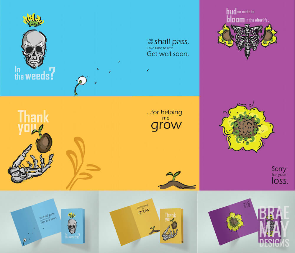
Each card in this thematically linked suite depicts a part of the human skeleton paired with flora that represent the spirit of the card. Bones strip away our race, sexuality, politics and religion and leave us with the eternal truth – we are all human. Flowers and Plants are a reminder that life grows on, blooms, and is reborn eternally.
Get well – Illness (either mental or physical) is something we may all experience, but you have to take time and rest and it will all clear, like dandelion fluff blowing in the wind.
Sympathy – Ribs store your most vital organs, your heart, your lungs, and your stomach, all parts that experience immense stress during the loss of a loved one.
Thank you – “Many hands make light work!”
I wanted to choose the type of cards that are there for life’s unexpected moments, the times where a card really means (to me) the most.
Skills Used:
- Illustrator
- Custom Graphics
- Illustrations
- Photoshop

GS&P
Advertising design is about drawing on emotions and creating an experience that connects the viewer to the product, much like visual communications connects the view to the message.
This layout is inspired by a series of posters the GS&P firm did of the Golden Gate Bridge, the posters focus heavily on color blocking and abstracting the form of the bridge to highlight its art deco inspirited flourishes. I was instantly drawn to the feeling of “gravity” I experienced in looking at some of these works as well as the sharp contrast between dark rusty crimson and muted chartreuse. I created vector images based on two of the posters that I felt fit this theme, something I feel both Jeff and Richard use effectively in their designs I wanted the viewer to feel a sense of gravity and tension as if looking at the water below a bridge.
Skills Used:
- Illustrator
- Layout
- InDesign
Divide and Conquer
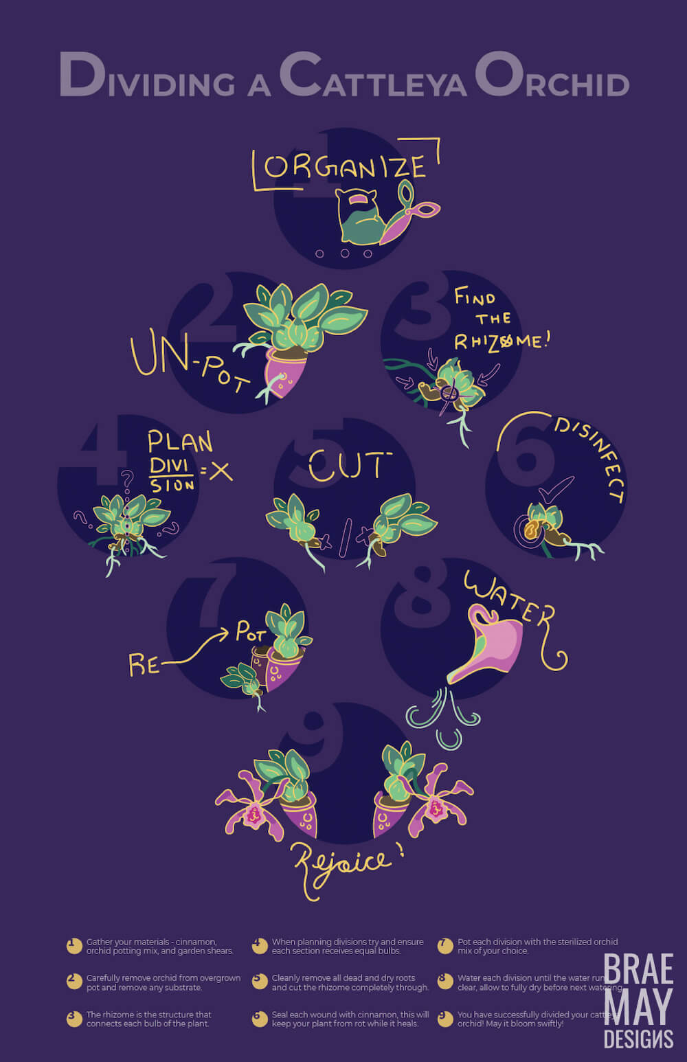
Cattleya Orchids are one of the most stunning species of orchid there is. I have a couple in my personal collection that blessed me with gorgeous magenta blooms this year. I decided to make a tribute to this flower by documenting the steps I took to clone it.
Division is a pretty fascinating part of plant procreation, but to replicate it indoors successfully takes a few careful steps. I wanted to create a graphic that any orchid enthusiast could hang in their plant room or greenhouse.
Skills Used:
- Illustrator
- Drawing Tablet
- Illustrations
- InDesign
Branding in Micro
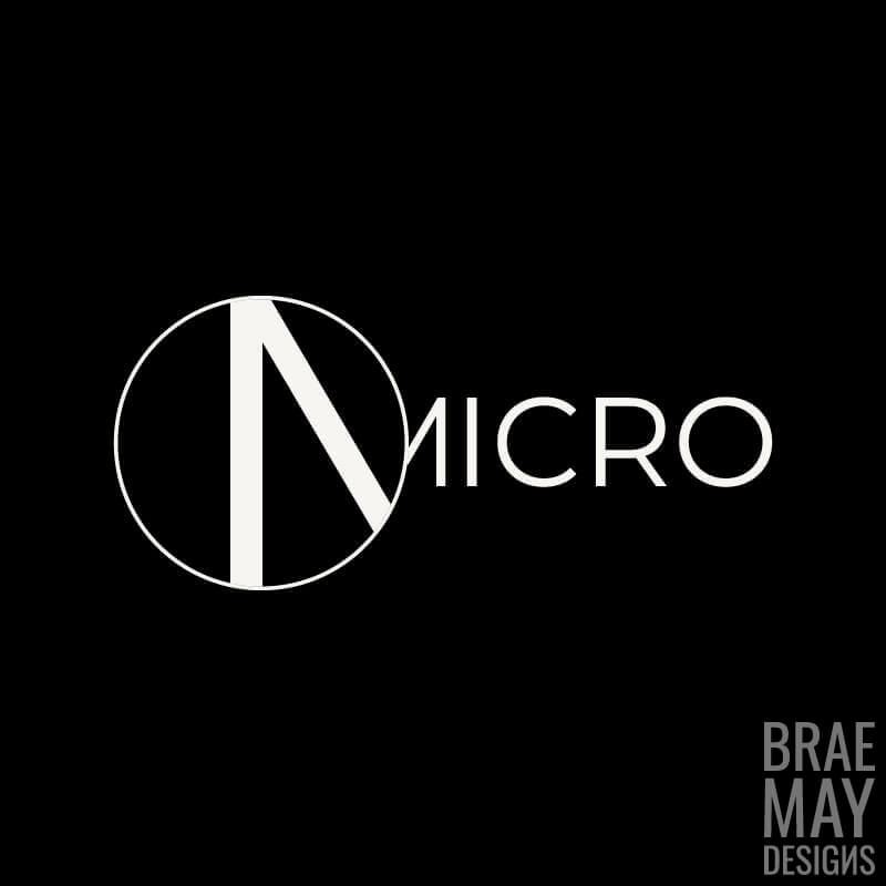
The aesthetic of the brand Micro is “finding beautiful detail in the smallest things,” I wanted the feel to be dramatic, intricate, and inspiring. There is beauty in the smallest things – seeds, insects… etc. I wanted to transfer this into a brand because I feel its marketable and can apply to any product. There is value and beauty in all things.
The Micro logo represents “looking into the details,” it’s a lens on top of text bringing out the finer details of the lettering/textures/imagery, depending on the application. The letter M is abstracted to basic lines under the magnifying lens because sometimes form and line stand out more in micro. It also doubles as the icon of a magnifying glass.
I wanted to keep the logo extremely flexible and minimal because a staple of the Micro brand is letting the subject do the “talking,” The brand itself is about paying attention to that message. Pausing. Viewing the beauty in the smaller things we often overlook.
Skills Used:
- Illustrator
- Branding
- Vector Design
- Typography
Pathogen Packaging
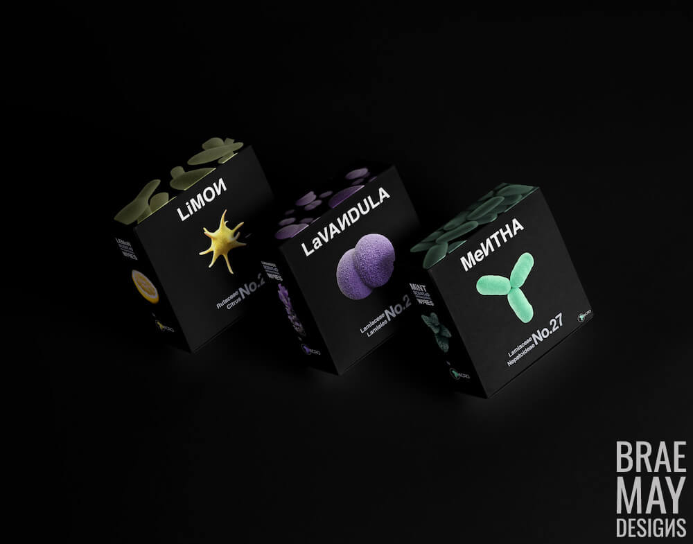
The concept is facial cleansing wipes with natural fragrances, the use of these is to cleanse your face before or after using your face mask – or just to disinfect your skin in general. Each product features a bacterium as the center image in vibrant colors reflective of the facial wipes scent. On the side panel (the one that would likely end up facing out on department store shelves) is a macro shot of flora, as well as a description of the natural scent and that they are antibiotic wipes.
I wanted the frontal image to raise intrigue and once the package was picked up the investigation would easily reveal what the item was, the Micro brand is about seeing things differently with close observation. During class we heard how COVID-19 has impacted the way we interact with our world, and we are on high alert to have hand sanitizer, but what about our ears, nose, mouth… ?
As the Micro brand represents focusing on the beauty in the smallest items I opted to get to the smallest part of this product, and that is its antibacterial nature. Ultimately anyone using this product wants to eliminate any pathogens on their skin and hopefully ward off infection.
Skills Used:
- Illustrator
- Branding
- Photoshop
- Typography